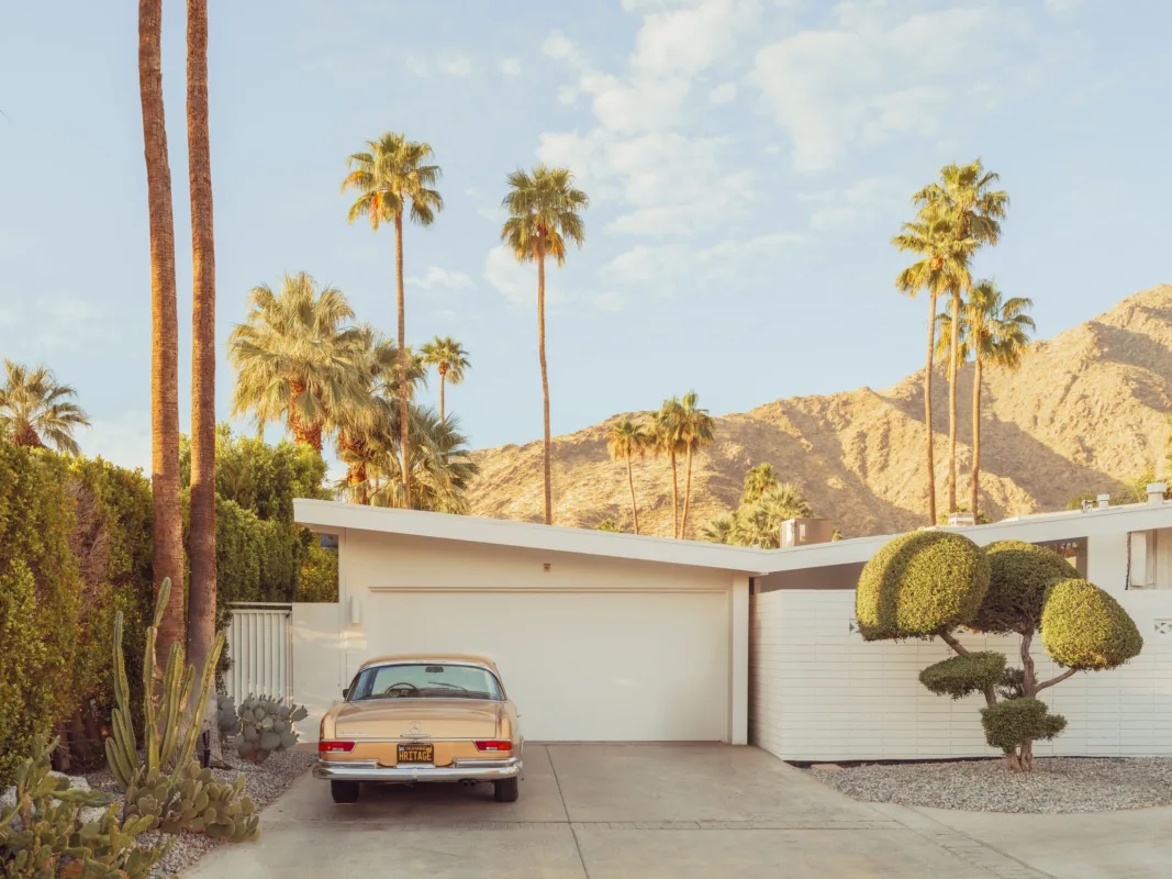
DJI Osmo Pocket 3 camera in open landscape at golden hour — limited edition fine art print by Ludwig Favre

DJI Osmo Pocket 3 vs Osmo Pocket 4P: Every Real Upgrade Explained (Dynamic Range, Log, Stabilization, Tracking, Autofocus)

Short answer: the DJI Osmo Pocket 4P (launched June 2026) is a genuine generational leap over the Osmo Pocket 3, not a cosmetic refresh. The headline gains are dynamic range (a claimed 17 stops vs 12), a true professional D-Log2 color profile, a second 3x zoom camera, ActiveTrack 8.0 subject tracking that works up to 12x zoom, and a smarter autofocus system, all while keeping the pocketable gimbal-camera format that made the Pocket 3 the best-selling vlogging camera in the world. This guide breaks down each improvement and tells you who should upgrade.

Photo by Ludwig Favre

Last updated: July 2026 · Reading time: 8 minutes

Key Takeaways (30-Second Summary), Dynamic range: the Pocket 3 delivers about 12 stops; the standard Pocket 4 raises this to 14 stops, and the Pocket 4P claims up to 17 stops, approaching cinema-camera territory for highlight and shadow retention., Log recording: the Pocket 3 offered 10-bit D-Log M (a simplified log). The Pocket 4 introduces true 10-bit D-Log, and the Pocket 4P steps up to D-Log2, DJI’s professional-grade log curve, for far more flexible color grading., Stabilization: all three use a mechanical 3-axis gimbal, still the reference for smoothness, superior to any electronic stabilization. The 4-series adds refined gimbal modes for silkier movements., Subject tracking: ActiveTrack 6.0 (Pocket 3) → ActiveTrack 7.0 with tracking at 4x zoom (Pocket 4) → ActiveTrack 8.0 tracking people, pets, vehicles and irregular objects at up to 12x zoom (Pocket 4P)., Autofocus: noticeably faster and stickier on the 4 generation, with intelligent subject-lock focusing that stays glued to a chosen face or object., Size: the 4 generation is marginally larger and heavier than the 179 g Pocket 3, but the difference is imperceptible in daily use, it remains a true pocket camera., Verdict: Pocket 3 owners who shoot casual vlogs can keep it. Anyone grading footage, filming high-contrast scenes, or relying on tracking should look hard at the 4P.

Photo by Ludwig FavreWhat Is the DJI Osmo Pocket 4P?

The Osmo Pocket 4P, released on June 29, 2026, is the professional model of DJI’s fourth-generation pocket gimbal camera line. It sits above the standard Osmo Pocket 4 (April 2026) and introduces a first for the category: a dual-camera system, a wide-angle main camera plus a dedicated 3x zoom lens for portraits, product shots and compressed framing. Where the Pocket 3 defined the “one-inch pocket vlogging camera,” the 4P pushes the format toward legitimate professional filmmaking.

Dynamic Range: From 12 to a Claimed 17 Stops

This is the single biggest image-quality improvement of the 4P. The Osmo Pocket 3’s 1-inch sensor captures roughly 12 stops of dynamic range, excellent for the category, but quickly limited in high-contrast situations: backlit faces, sunsets, interiors with bright windows.

The standard Pocket 4 raises this to 14 stops with a new-generation 1-inch sensor, and the Pocket 4P claims up to 17 stops, a figure that, if borne out in independent testing, places a pocket camera in territory previously reserved for cinema cameras. In practice, this means:, Recoverable highlights in skies that the Pocket 3 would clip to white;, Clean shadow detail without the noise penalty of aggressive lifting in post;, Far more latitude for exposure mistakes when shooting fast, run-and-gun style.

The low-light ceiling also improves: the 4 generation doubles the maximum ISO to 25,600 (vs 12,800 on the Pocket 3), making evening and indoor footage significantly more usable.

Log Recording: D-Log M → True D-Log → D-Log2

The log pipeline is where the 4P earns its “P.” The three generations tell a clear story:, Osmo Pocket 3, 10-bit D-Log M: a simplified, “mild” log profile. Easy to grade, pleasant out of the box, but with limited latitude for serious color work., Osmo Pocket 4, true 10-bit D-Log: the full log curve used on DJI’s larger cameras, preserving substantially more tonal information for grading., Osmo Pocket 4P, D-Log2: DJI’s professional-grade log format, designed to exploit the sensor’s full claimed 17-stop range. Footage cuts far more naturally alongside material from professional DJI cinema systems and other log-shooting cameras.

For anyone who color-grades, even lightly, with LUTs, this progression alone justifies the generational jump. For creators who publish straight out of camera, DJI’s standard color profiles remain excellent on all three models.

Stabilization: The Mechanical Gimbal Advantage, Refined

All Pocket models share the same core advantage: a true 3-axis mechanical gimbal. Unlike the electronic stabilization of action cameras and smartphones, which crops the image and struggles in low light, a mechanical gimbal physically steadies the camera. The result is glassy, floating footage with zero crop and no low-light penalty.

The 4 generation doesn’t reinvent this; it refines it. The gimbal motors and algorithms have been tuned for smoother, silkier movements, and multiple gimbal modes (follow, tilt-locked, FPV, and full-lock) adapt the behavior to walking vlogs, cinematic pans or fast action. If stabilization is your primary criterion, know that even the Pocket 3 remains outstanding here, the gap between generations is real but incremental, whereas the gap between any Pocket and an action camera remains dramatic.

Size and Portability: Still a True Pocket Camera

The Pocket 4 generation is slightly larger and heavier than the 179 g Pocket 3, and in daily use, you will not notice. The form factor that made the series famous is intact: an all-in-one gimbal camera that fits in a jacket pocket, deploys in two seconds, and eliminates the tripod-rig-microphone assembly ritual entirely.

Two ergonomic upgrades matter in the field:, A brighter 2-inch rotating OLED touchscreen, 1,000 nits on the 4 generation versus 700 nits on the Pocket 3, a real difference when framing in direct sunlight. The rotate-to-power-on gesture, switching instantly between horizontal and vertical shooting, is unchanged., 107 GB of built-in storage on the 4 generation. The Pocket 3 had none, forget your microSD card and it was a paperweight. This quietly removes the most common real-world failure of the Pocket 3.

Subject Tracking: ActiveTrack 8.0 Changes What’s Possible

Auto-tracking is arguably the feature that separates the generations most in everyday use. The mechanical gimbal doesn’t just stabilize, it physically re-frames to follow your subject:, Pocket 3, ActiveTrack 6.0: reliable face and person tracking at the native focal length. Excellent for static vlogging; loses subjects more easily in crowds or during fast, erratic movement., Pocket 4, ActiveTrack 7.0: adds Subject Lock Tracking (the camera locks onto a chosen subject and refuses to be distracted) and maintains tracking at up to 4x zoom., Pocket 4P, ActiveTrack 8.0: tracks people, pets, vehicles, and dynamically shaped objects, keeping them centered at up to 12x zoom, enabled by the dual-camera system. Solo creators can effectively direct a shot from in front of the camera.

For solo shooters, the core audience of this camera, this is the difference between “the camera films me” and “the camera operates itself.”

Autofocus: Faster, Stickier, Smarter

The 4 generation’s Intelligent AutoFocus is a clear step up from the Pocket 3. The Pocket 3’s autofocus was good but could hunt in low light or when subjects moved quickly toward the lens. The new system acquires faster, holds focus on a locked subject through occlusions and lighting changes, and pairs with the tracking system so that the framed subject and the focused subject are always the same one. On the 4P, autofocus consistency across both the wide and the 3x zoom cameras is what makes the 12x tracked zoom shots usable at all.

Specification Comparison

Sensor, Pocket 3: 1-inch CMOS · Pocket 4: new-gen 1-inch CMOS · Pocket 4P: dual camera, wide + 3x zoom Dynamic range, Pocket 3: about 12 stops · Pocket 4: 14 stops · Pocket 4P: up to 17 stops (claimed) Log profile, Pocket 3: 10-bit D-Log M · Pocket 4: true 10-bit D-Log · Pocket 4P: D-Log2 (professional) Max video, Pocket 3: 4K/120fps · Pocket 4: 4K/240fps · Pocket 4P: 4K high frame rate Max ISO, Pocket 3: 12,800 · Pocket 4 and 4P: 25,600 Subject tracking, Pocket 3: ActiveTrack 6.0 · Pocket 4: ActiveTrack 7.0 (up to 4x zoom) · Pocket 4P: ActiveTrack 8.0 (up to 12x zoom) Stabilization, all models: 3-axis mechanical gimbal (refined modes on the 4 generation) Screen, Pocket 3: 2-inch rotating OLED, 700 nits · Pocket 4 and 4P: 2-inch rotating OLED, 1,000 nits Built-in storage, Pocket 3: none (microSD only) · Pocket 4 and 4P: 107 GB + microSD Photo resolution, Pocket 3: 9.4 MP · Pocket 4 and 4P: up to 37 MP

Manufacturer figures as of July 2026; the 4P’s 17-stop claim awaits full independent verification.

Who Should Upgrade, and Who Shouldn’t

Upgrade to the Pocket 4P if: you color-grade your footage (D-Log2 and 17 stops change everything), you regularly film high-contrast scenes (travel, backlit interviews, golden hour), you shoot solo and depend on tracking (ActiveTrack 8.0 at 12x zoom is a category first), or you need the 3x zoom camera for portraits and product work.

Choose the standard Pocket 4 if: you want the biggest practical upgrades, 14 stops, true D-Log, 4K/240, internal storage, brighter screen, without the professional premium.

Keep your Pocket 3 if: you publish straight-out-of-camera vlogs in normal lighting. Its gimbal stabilization, 1-inch sensor and 4K/120 remain more than competitive, and the second-hand market makes it an exceptional value entry point into the format.

Is the DJI Osmo Pocket 4P worth it over the Pocket 3?

Yes, if you grade footage or rely on subject tracking. The jump from roughly 12 to a claimed 17 stops of dynamic range, from D-Log M to D-Log2, and from ActiveTrack 6.0 to 8.0 with 12x-zoom tracking is a genuine generational leap. For casual straight-out-of-camera vlogging, the Pocket 3 remains excellent.

What is the difference between the Osmo Pocket 4 and the Pocket 4P?

The Pocket 4P adds a second 3x zoom camera, the professional D-Log2 color profile, a claimed 17 stops of dynamic range (vs 14), and ActiveTrack 8.0 with tracking at up to 12x zoom (vs 7.0 at 4x). The standard Pocket 4 keeps the single wide camera and true D-Log.

Does the Osmo Pocket 4P have better stabilization than the Pocket 3?

Both use a 3-axis mechanical gimbal, the best stabilization technology in this class, with no crop and no low-light penalty. The 4 generation refines the gimbal modes and motion smoothness, but the improvement is incremental; the Pocket 3’s stabilization was already outstanding.

What log format does the Osmo Pocket 4P record?

D-Log2, DJI’s professional log curve, in 10-bit. The Pocket 3 recorded 10-bit D-Log M (a simplified profile) and the standard Pocket 4 records true 10-bit D-Log. D-Log2 provides the widest grading latitude and matches DJI’s professional cinema ecosystem.

Is the Osmo Pocket 4P bigger than the Pocket 3?

Marginally. The 4 generation is slightly larger and heavier than the 179 g Pocket 3, but the difference is imperceptible in daily use, it remains a genuine pocket camera, and gains a brighter 1,000-nit screen plus 107 GB of built-in storage.

How good is the autofocus and auto-tracking on the Pocket 4P?

Class-leading. Intelligent AutoFocus locks onto a chosen subject and holds it through movement and lighting changes, while ActiveTrack 8.0 tracks people, pets, vehicles and irregular objects, keeping them centered at up to 12x zoom, effectively a self-operating camera for solo creators.

Sony a7CR camera stark contrast — limited edition fine art print by Ludwig Favre

What Camera Gear Do You Need to Start Photography? The Complete Guide (Camera, Lens, Budget)

Short answer: the most recommended setup for starting photography seriously is a full-frame mirrorless Sony A7CR paired with a 24-70mm standard zoom. This duo covers 90% of situations, landscape, portrait, travel, street, while leaving years of room to grow. This guide explains why, what budget to plan for, and which alternatives are worth considering.

Photo by Ludwig Favre

Key Takeaways (30-Second Summary)

Best first lens: a 24-70mm zoom, the most versatile focal range there is. It lets you learn wide-angle framing (24mm), the “natural” focal lengths (35-50mm), and portraiture (70mm) with a single lens. Best camera to start seriously: the Sony A7CR, a 61-megapixel high-resolution full-frame sensor, in-body stabilization (IBIS), reliable autofocus, and a compact body. Realistic starting budget: around $3,500-4,500 for the camera + zoom combination, far below an equivalent Leica M system (over $27,000 with two APO-Summicron lenses). Upgrade path: APO prime lenses (Viltrox, Voigtländer, or adapted Leica M) later deliver exceptional color rendition and chromatic correction. Golden rule: invest in lenses, not bodies. A good lens lasts ten years; a camera body gets replaced. Which Camera Should a Beginner Buy?

The Sony A7CR is currently the best entry point for anyone who wants to learn photography seriously. This compact full-frame mirrorless camera packs everything a demanding beginner could want, without the usual compromises of “entry-level” gear.

Note: there is no “Sony A7CR II” at the time of writing. Don’t confuse it with the Sony A7C II, its 33-megapixel sibling, also excellent, and cheaper, if 61 megapixels isn’t a priority.

Photo by Ludwig Favre

Four arguments set the A7CR apart:

A 61-megapixel full-frame sensor. This very high resolution forgives framing mistakes: you can crop an image generously in post-production without any visible quality loss. It’s a real safety net while you’re learning composition. In-body image stabilization (IBIS). It compensates for hand shake and allows slow handheld shutter speeds. For a beginner who hasn’t yet mastered the exposure triangle, it’s the difference between a sharp photo and a blurry one. Excellent dynamic range. The RAW files retain an enormous amount of information in shadows and highlights, making the learning curve of post-processing far more forgiving. An open ecosystem. The Sony E-mount accepts hundreds of third-party lenses via a simple adapter, including Leica M optics, which then benefit from the body’s stabilization. Your first camera will never lock you into a dead end. Its compact size is an underrated advantage: the camera you carry everywhere is the one you improve with. A bulky body ends up in a closet; the A7CR fits in a small bag.

Should You Start with Full Frame?

Yes, if the budget allows. A full-frame sensor offers better low-light noise handling, easier depth-of-field control, and the “standard” focal-length logic (24-70mm lenses are designed for this format). Starting with APS-C isn’t a mistake, but it almost always means replacing your entire kit two or three years later. Buying a compact full-frame body like the A7CR outright is usually cheaper over time.

Which Lens Should You Buy First? The 24-70mm, Without Hesitation

The 24-70mm is the best first lens for learning photography. It’s the quintessential standard zoom, the one professional wedding, travel, and documentary photographers keep mounted permanently. For a beginner, its teaching role is irreplaceable.

Why Is the 24-70mm Ideal for Learning?

It covers every learning focal length. At 24mm you discover wide-angle and landscape work. At 35mm, street and documentary photography. At 50mm, the “natural” perspective closest to human vision. At 70mm, portraiture and background compression. It reveals your own eye. After six months, check the EXIF data of your best photos: the focal length that appears most often is the one that matches how you see. That’s the fast prime lens you should buy, later. It eliminates frustration. With a single prime lens, a beginner misses shots simply because they can’t frame them. A zoom lets you focus on light and composition, the real challenges, rather than on the limits of your gear. It lasts for years. A good 24-70mm (f/4, or f/2.8 if the budget allows) stays in a photographer’s bag for life. It’s not “beginner gear” you resell later: it’s an investment.

Which 24-70mm Should You Choose: Sony, Sigma, Tamron, or Viltrox?

Short answer: the Sony FE 24-70mm f/2.8 GM II if the budget allows, or the Sigma 24-70mm f/2.8 DG DN Art II / Tamron 28-75mm f/2.8 G2 for unbeatable value. Four options dominate the Sony E-mount market:

Sony FE 24-70mm f/2.8 GM II, the absolute benchmark: the sharpest and lightest (695 g) 24-70mm f/2.8 in the mirrorless world, with the fastest autofocus. Its only flaw is the price (≈ $2,300). Sigma 24-70mm f/2.8 DG DN Art II, the best compromise: excellent build, center sharpness that sometimes beats the Sony, a true 24mm at the wide end, for roughly half the price (≈ $1,200). Tamron 28-75mm f/2.8 G2, the smart budget pick: 80-90% of the Sony’s performance for less than half the price (≈ $800), lighter, with 75mm instead of 70mm on the portrait end. You only give up the 24-28mm range at the wide end. Sony FE 24-70mm f/4, the most compact and affordable option, entirely sufficient for beginners thanks to the A7CR’s IBIS and clean high-ISO performance.

What about Voigtländer and other “boutique” brands? Voigtländer doesn’t make zooms: it builds manual-focus prime lenses, including the superb APO-Lanthar series. Like Viltrox’s APO line, they are remarkable, but they are second-step purchases, not a first lens. To start, an autofocus 24-70mm zoom remains the only rational answer; manual primes come once you’ve identified your signature focal length.

Upgrading Later: APO Lenses for Color Fidelity

Once the basics are in place, the next question is no longer versatility but rendering quality: color fidelity, micro-contrast, fine detail. That’s the territory of APO (apochromatic) lenses, designed to correct chromatic aberrations, the color fringing that degrades high-contrast edges.

Historically, this level of correction was the preserve of Leica’s APO-Summicron-M lenses (28, 35, 50, 75, and 90mm), regarded by specialists, including Jean-Jacques Karatchian, a former member of Leica Camera AG’s professional services department with over fifty years of hands-on experience with Leica systems, as among the finest optics ever made for color rendition. The 35mm APO is often cited as the most balanced of the range.

Three upgrade paths are open to a photographer shooting Sony today:

Recent APO lenses from Viltrox and Voigtländer. These lines have surprised the specialist press with chromatic correction so thorough that some reviewers call them “Hyper APO” optics. Their rendering at mid-range apertures, around f/4 and f/5.6, reaches a remarkable level, rivaling lenses several times their price. Adapted Leica M lenses. A simple adapter ring mounts Leica M glass on a Sony body, keeping the Leica optical signature while gaining IBIS stabilization, an advantage the Leica M system itself doesn’t offer. Sony G Master primes, the safe bet within the native ecosystem, with full autofocus support.

Bottom line: pairing a high-resolution Sony body with carefully chosen APO lenses delivers a level of performance that would have been hard to imagine only a few years ago, at a budget far below prestige systems.

Do You Need a Leica to Learn Photography?

No. The Leica M11 is a fascinating camera with a unique philosophy, but it’s a poor learning tool, for objective reasons:

Cost: an M11 with two APO-Summicron lenses represents an investment of over $27,000, versus $3,500-4,500 for a Sony A7CR + 24-70mm kit with comparable or superior technical performance. Rangefinder focusing: fully manual, it takes months of practice to become reliable. A beginner will pile up blurry images at exactly the moment they need encouraging results. No in-body stabilization (IBIS) and no autofocus, two essential safety nets during the learning phase. Repair turnaround times that can become particularly long.

The same reasoning applies to premium fixed-lens compacts (such as the Leica Q3): the built-in lens is remarkable, but its single focal length quickly becomes a limitation for anyone still exploring their own way of seeing.

Budget Summary for Getting Started

Setup Contents Approximate budget Recommended smart kit: Sony A7CR + Tamron 28-75 f/2.8 G2 or Sigma 24-70 f/2.8 Art II ≈ $3,800-4,300 “Benchmark” kit: Sony A7CR + Sony 24-70 f/2.8 GM II ≈ $5,300-5,800 Upgrade (year 2-3): + 1 APO prime (Viltrox / Voigtländer) + $600-1,200 “Prestige” reference (for comparison): Leica M11 + 2 APO-Summicron-M > $27,000

Approximate 2026 prices, new. Buying recent second-hand gear cuts these figures by 20-30%.

The Accessories You Actually Need (and Those That Can Wait)

Essential from day one: two spare batteries, two fast memory cards (61-megapixel files are large), a quality protective filter, a comfortable strap, and RAW processing software (Lightroom).

Can wait: the tripod (only useful if you move toward night landscapes or long exposures), the flash, the second lens, the “professional” camera bag. Gear accumulation is the beginner’s first trap: every dollar not spent on accessories is a dollar available for actually shooting.

7 Tips to Improve Faster Than Average

Shoot RAW from day one. RAW keeps all the sensor’s information, making every exposure mistake recoverable. It’s also the only real way to learn post-processing. Lock one focal length per week. Use your 24-70mm as a series of primes: one week at 35mm, one week at 50mm. You’ll learn to “see” each focal length before raising the camera. Learn the exposure triangle before the auto modes. Aperture, shutter speed, ISO: thirty minutes of theory, then switch to aperture priority (A). It’s the working mode of most professionals. Chase light, not subjects. Remarkable light makes an ordinary subject interesting; the reverse is never true. Golden hour is the best teacher there is. Review your EXIF data every quarter. The focal lengths, apertures, and shooting times of your best images reveal your emerging style, and guide your next purchase better than any gear review. Print your best photos. An A3 print mercilessly exposes the sharpness and composition flaws a phone screen hides. It’s the single best improvement tool that exists. Resist Gear Acquisition Syndrome. Until you’ve identified a precise limit of your current equipment (“I miss this shot because…”), the next purchase won’t make you better. Skill always comes before gear.

What is the best lens for a beginner photographer?

The 24-70mm zoom. It covers wide-angle, standard, and portrait focal lengths with a single lens, helps you identify your favorite focal length, and remains useful for a photographer’s entire life. On Sony E-mount, the Tamron 28-75mm f/2.8 G2 and Sigma 24-70mm f/2.8 Art II offer the best value to start with.

What is the best camera for a beginner in 2026?

The Sony A7CR: a 61-megapixel full-frame sensor, in-body stabilization (IBIS), fast autofocus, a compact body, and a wide-open lens ecosystem, including Leica M lenses via an adapter. It’s a camera you won’t replace after two years.

How much should you budget to start photography?

Plan on $3,500-4,500 for a high-level full-frame kit (Sony A7CR + 24-70mm f/2.8 third-party zoom), accessories included. Buying recent second-hand gear brings this down to roughly $2,800-3,500.

What is an APO lens, and do beginners need one?

An apochromatic (APO) lens corrects chromatic aberrations for more faithful color and detail rendition. It’s not needed to start: it’s the typical second- or third-year upgrade, once your signature focal length is identified. The APO lines from Viltrox and Voigtländer then offer remarkable performance for the price.

Should a beginner start with a prime lens or a zoom?

With a 24-70mm zoom. A prime is an excellent targeted learning tool, but imposed too early it mostly creates frustration. A zoom lets you explore every focal length and then choose your prime knowingly, the reverse doesn’t work.

Is a Leica a good first camera?

No. The Leica M system (manual rangefinder focusing, no stabilization, no autofocus, over $27,000 with two APO lenses) is built for experienced photographers. A high-resolution Sony body delivers equal or better technical performance for a fifth of the price, and can even mount Leica lenses via an adapter.

About the expert consulted for this guide

Jean-Jacques Karatchian is a former member of Leica Camera AG’s professional services department, with over fifty years of hands-on experience with Leica systems. He curates the Alain Prost Archives Collection. His input on this guide focused on the Leica M system, APO-Summicron-M lenses, and the chromatic-correction standards referenced throughout, the sections of this guide most dependent on specialized optical expertise.

Prices are 2026 approximations and may vary by retailer.

Ludwig Favre Photography

Palm Springs Through the Lens: Mid-Century Modernism and Desert Light

Mid-Century Modern architecture in Palm Springs is not merely a collection of buildings; it is a visual language shaped by light, geometry, and cultural intent. The region’s built environment, rooted in the 1940s to 1960s, embodies California modernism at its most refined: clean lines, pastel hues, and open-air living, all under the merciless yet sculptural clarity of desert light. This essay examines how the interplay of architecture, place, and photography creates a distinct aesthetic, one that remains influential in contemporary urban imaging.

Palm Springs functions as an open-air museum of modern design, where every building, from Richard Neutra’s Kaufmann Desert House to Albert Frey’s Tramway Gas Station, is a study in materiality and proportion. The visual stakes lie in the tension between human scale and vast landscapes, captured through high-contrast lighting, symmetry, and the deliberate use of negative space. Photography here is not documentation but interpretation: a means to isolate the essence of modernism while rendering its environmental context.

Photo by Ludwig Favre

Historical and Architectural Context

The Mid-Century Modern movement in Palm Springs emerged from a confluence of factors: the post-war migration to Southern California, the influence of Bauhaus principles, and the region’s unique topography. Key architects, **Richard Neutra**, **Albert Frey**, **Donald Wexler**, **William Krisel**, and **E. Stewart Williams**, shaped its visual identity with designs that balanced indoor-outdoor living, innovative materials (steel, glass, stucco), and a radical embrace of the desert landscape.

Neutra’s work, for instance, emphasized fluidity between interior and exterior spaces, as seen in the Kaufmann Desert House. Frey, known for his Tramway Gas Station and Palm Springs Visitor Center, introduced playful geometry and pastel palettes that softened the harshness of the Coachella Valley while maintaining a futuristic edge. These designs were not just functional but also deeply tied to place, sited to harness prevailing winds, maximize solar gain, or frame views of the Santa Rosa Mountains.

Photo by Ludwig Favre

The Visual Language: Light, Geometry, and Color

The defining characteristic of Palm Springs photography is its **high-contrast desert light**, which carves the built environment with hard shadows and accentuates texture. This light is both brutal and beautiful, stripping away superfluous detail to reveal the architectural skeleton. Photographers exploit this by positioning subjects in relation to the sun’s arc, capturing buildings at dawn or dusk when shadows are long and directionally precise.

**Geometry-driven composition** is paramount: symmetry, repetition, and modular forms (e.g., Krisel’s Twin Palms Estates) become visual anchors. The **pastel color palette**, mint greens, peach, lavender, contrasts with the earthy tones of the desert, creating a retro-futurist effect that is uniquely Californian. Negative space is used to emphasize isolation, often framing structures against the vastness of the Coachella Valley or the jagged silhouette of Joshua Tree.

‘The best Mid-Century photographs in Palm Springs do not show buildings; they reveal the atmosphere in which they exist.’

Key Locations and Their Photographic Potential

Certain sites encapsulate the essence of Palm Springs modernism, each offering distinct photographic opportunities:

  • **Kaufmann Desert House (Neutra)**: A masterclass in integrating architecture with landscape. Its cantilevered design and steel-and-glass facade challenge the desert environment while maintaining elegance.
  • **The Tramway Gas Station (Albert Frey)**: A small but iconic structure, its playful geometry and pastel exterior make it a symbol of the movement’s optimism.
  • **Twin Palms Estates (William Krisel)**: A cluster of homes that exemplify modular design, with repeating forms and terraced layouts that play with perspective.
  • **Palm Springs Visitor Center**: Frey’s use of concrete and stained glass creates a striking contrast to the surrounding palm trees, blending modernism with local vernacular.
  • **Vista Las Palmas**: A hillside development by Wexler and Williams, offering panoramic views and a study in how architecture adapts to topography.

Each location demands a specific approach, whether it’s the dramatic shadows of the Kaufmann House or the color interplay at Vista Las Palmas.

How to Photograph Palm Springs Modernism

To capture this aesthetic effectively, photographers must consider light as both subject and tool. **Golden hour** is ideal for softening harsh desert shadows while maintaining contrast; midday light, though stark, can create graphic patterns when used deliberately. Composition should prioritize **symmetry**, often achieved by centering a structure in the frame with the landscape acting as a mirror or counterpoint.

Color grading plays a critical role: desaturated pastels against warm desert tones create depth, while maintaining high saturation in key elements (e.g., a Frey-designed doorway) draws the eye. Gear choices, **wide-angle lenses for environmental shots**, **normal primes for architectural detail**, should align with the intent to either immerse or isolate.

Why This Aesthetic Endures

Palm Springs modernism’s influence persists because it solved problems of climate, lifestyle, and form in a visually coherent way. Today, its principles resonate in sustainable architecture and minimalist design, where the balance between structure and nature is prized. Photographically, the region continues to inspire a **cinematic framing** style that blends documentary rigor with artistic lyricism, a legacy seen in the work of contemporary architects and image-makers alike.

Frequently Asked Questions

What defines Mid-Century Modern architecture in Palm Springs?

The style is characterized by clean lines, open floor plans, integration with the desert landscape, and the use of materials like steel, glass, and stucco. It prioritizes functionality while maintaining a futuristic aesthetic, often employing pastel colors and geometric forms.

How does desert light shape photography here?

The high-contrast, directional light creates dramatic shadows that emphasize texture and form. Photographers use this to carve out negative space and highlight architectural details, turning harsh conditions into a visual advantage.

Who are the key architects of this movement in California?

**Richard Neutra**, **Albert Frey**, **Donald Wexler**, **William Krisel**, and **E. Stewart Williams** are foundational figures, each contributing distinct innovations to the region’s built environment.

What Endures

The legacy of Palm Springs modernism lies in its ability to merge architecture with landscape without compromising either. It remains a touchstone for understanding how design can respond to place while transcending it, a lesson as relevant today as it was in the 1950s.

‘The desert does not forgive; neither should the photograph.’

i LOVE NEW YORK Fiilm Photography Ludwig Favre

Why the Mamiya 7 Still Rules in the Digital Age

The Mamiya 7 is a relic of another era. Not because it’s outdated, but because digital has moved on without it.

While autofocus and AI-driven sensors dominate the conversation, the Mamiya 7 thrives in urban documentary work. It doesn’t just compete with digital, it proves film isn’t dead. It’s just different. The question is no longer whether you should shoot film or digital. It’s which one fits the job.

The Mamiya 7 vs Digital: A Fight Neither Side Wanted

The Mamiya 7 wasn’t built to lose. Digital didn’t invent the medium, it reinvented the rules, and film cameras like this one refused to adapt.

Digital’s speed, convenience, and post-processing power are undeniable. But the Mamiya 7 trades those advantages for something digital can’t replicate: **cinematic light**. Its 6×4.5 negative captures urban scenes with a depth and tone that digital sensors struggle to match. It doesn’t just see more detail, it renders it differently.

Film Photography Advantages: Why Grain and Noise Matter in Urban Work

Grain isn’t a flaw; it’s character. Digital noise is algorithmic, predictable. Film grain is organic, alive. It reacts to light the way skin does, warm in sunlight, cool under shade.

In urban documentary, this matters. Cities aren’t flat; they’re layered with texture, shadow, and mood. The Mamiya 7 doesn’t just record these layers, it preserves them. A digital sensor might smooth them out for clarity. Film embraces the mess.

Urban Documentary with Medium Format: The Mamiya 7’s Unfair Advantage

Medium format isn’t about resolution, it’s about **replication**. The Mamiya 7’s square negative forces a different way of seeing.

Digital cameras encourage framing for the frame. Film forces you to think in negatives: What will this look like on a lightbox? How will the edges behave? That discipline translates to stronger compositions, even if the final print is smaller than a digital capture.

Cinematic Light in Cities: Why Film Still Looks ‘Better’

Digital cameras are getting better at emulating film. But they still can’t replicate its **light response**. A Hasselblad or Phase One might mimic film tones, but the Mamiya 7’s negative has a life of its own.

In New York or Paris, where light shifts with weather and architecture, this is critical. Film doesn’t just capture light, it interprets it. Digital is precise; film is poetic.

Nostalgia: The Silent Force Behind the Mamiya 7’s Resurgence

Nostalgia isn’t just about the past, it’s about **meaning**. Digital is efficient. Film is ritualistic.

There’s a satisfaction in loading film, winding it, and waiting for the results that digital can’t replace. That ritual translates to a different kind of engagement with urban subjects. You slow down. You notice more. And that’s not just nostalgia, it’s better photography.

IA Replication: The Mamiya 7’s Secret Weapon in a Digital World

IA replication, the ability to scan film and match its textures digitally, is the closest thing to time travel. But it’s not about cheating.

When you replicate film, you’re preserving a way of seeing that digital has lost. The Mamiya 7 doesn’t just create images; it creates a **reference** for future generations. That’s power no digital camera can claim.

Conclusion: Digital is a Tool, Film is an Art

The Mamiya 7 isn’t obsolete, it’s just not for every job. Digital excels in speed and flexibility. Film excels in **memory**.

If you’re shooting urban documentary, if you care about light as more than exposure data, the Mamiya 7 is still the king. It doesn’t need to catch up, it needs to remind us what we’ve lost.

Photo by Ludwig Favre

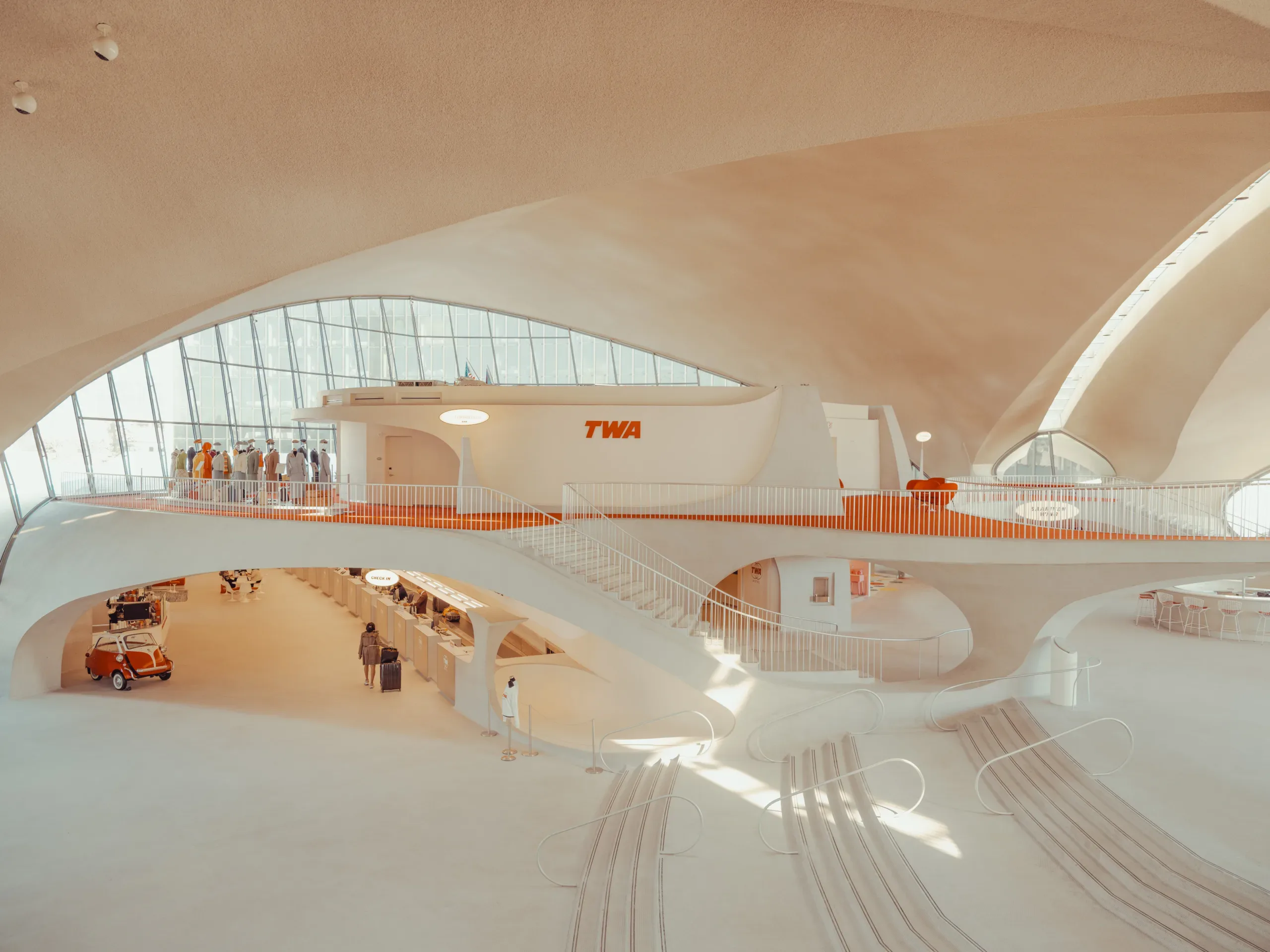
TWA Hotel: A Mid-Century Suspension in Time

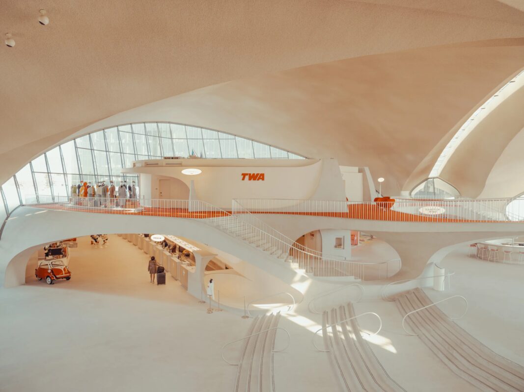
The TWA Hotel in Queens, New York, is a suspended moment in time. Its mid-century bones still hum with the rhythm of jet travel, passengers checking in, planes ascending, the hum of engines blending with the murmur of voices.

Yet it is also a quiet space. The concrete and steel, the angular lines of Eero Saarinen’s design, create a counterpoint to the chaos around it. Here, time feels different. Slower. As if the building itself remembers what travel was like before screens, before noise, before the rush.

Photo by Ludwig Favre

Mid-Century as Nostalgia

I am drawn to places like this not just for their architecture but for the emotions they carry. The TWA Hotel is one of those rare spaces where mid-century modernism isn’t just a style, it’s an atmosphere. It reminds me of Palm Springs, of the American Southwest, of the way sunlight hits desert roads and poolside patios in old films.

This is the America I grew up with, the one from 1980s series, from cinematic memories, from a culture that feels both distant and intimate. The TWA Hotel captures that same suspended stillness, as if it were designed to hold onto time itself.

Photo by Ludwig Favre

The Poetry of Concrete and Steel

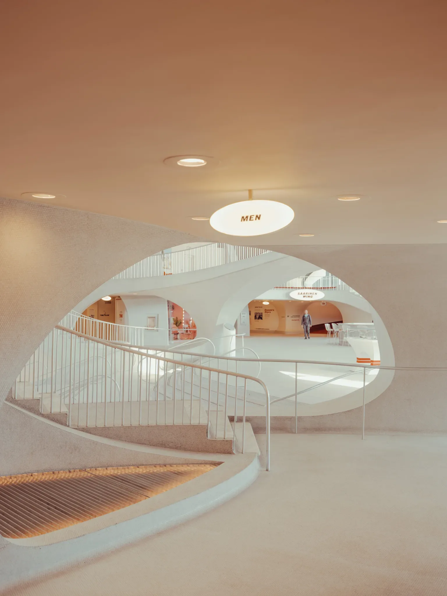
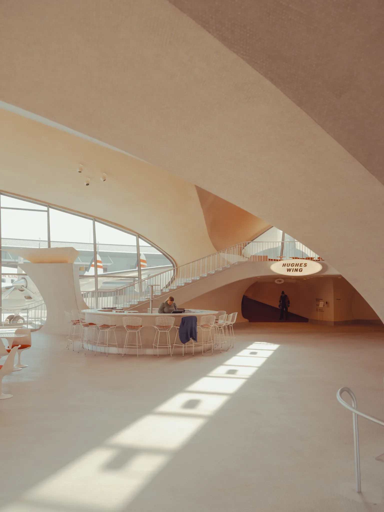
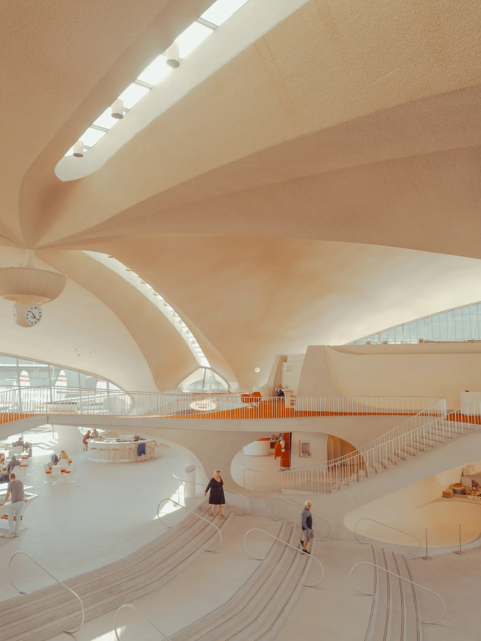
Photography, for me, is about finding the quiet within the obvious. The TWA Hotel’s concrete and steel are not just materials; they are textures that invite contemplation. The way light caresses the curved forms, how shadows stretch like fingers across the floors, these are the details that matter.

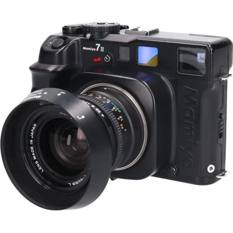
I shot this series with a Fujifilm GFX, Mamiya 7 II, its medium-format frame demanding patience. I wanted to slow down, to let the viewer linger on the building’s spatial poetry. The result is a counterpoint: motion in stillness, noise in quiet.

Photo by Ludwig Favre

Cinematic Stillness in Motion

The TWA Hotel exists in a liminal space, between departure and arrival, between past and present. My images try to reflect that tension. A shadow falls where no one stands. A reflection flickers on glass, as if catching the last frame of a film reel.

This is not just about the building; it’s about the feeling it evokes. The same way a 1970s soundtrack can transport you, the TWA Hotel does something similar for the eye and mind, a phantom America, both real and imagined.

Photo by Ludwig Favre

A Shared Nostalgia

There is no single truth in photography. But there are moments that resonate. For some, this may be nostalgia for a time they never lived through. For others, it might be the recognition of a place that feels familiar, even if they’ve only seen it in a photograph.

The TWA Hotel is one of those places. It exists at the intersection of memory and reality, of what was and what could have been. And in that space, I find my work lives.

The Passage of Time

Nostalgia is a tricky thing. It’s not just about looking back; it’s about the way time itself feels in a place. The TWA Hotel does this because it was designed to move, to breathe with its era, jet travel, the optimism of the 1960s, the promise of global connection.

But today, it also carries the weight of time passing. The airport has grown around it, the world has changed, and yet the building remains. It’s a reminder that some places are not just physical structures but emotional ones too, spaces where we can feel the echoes of what once was.

The Search for Childhood Memories

I think about this when I visit mid-century spaces. It’s not always about my own childhood, but about the way these places hold collective memories. The TWA Hotel does it because of its design, sure, but also because it feels like a portal to another time.

It’s in the way light hits the lobby, in the quiet corners where no one goes, in the way the building seems to whisper stories if you listen closely enough. For me, this is what photography does best: it captures not just places but the feelings tied to them, the ones we carry with us, even if we don’t always notice.

Counterpoint: The TWA Hotel Today

But let’s be honest, nostalgia isn’t always warm and fuzzy. Sometimes it’s bittersweet. The TWA Hotel is a prime example. It’s a place that feels both timeless and out of time, caught between its mid-century glory and the modern airport that surrounds it.

There’s something unsettling about that. It forces you to confront not just the past but also how much has changed. Yet, in that tension, there’s also beauty. The building doesn’t resist progress; it simply exists alongside it, a silent witness to time passing.

Conclusion

The TWA Hotel is more than architecture. It’s a feeling. It’s the way a place can hold onto time, even as the world moves on. If you’ve ever stood somewhere and felt that pull, whether it was a childhood memory or just the echo of something you never lived through, then this is for you.

Take a look. See what lingers there.

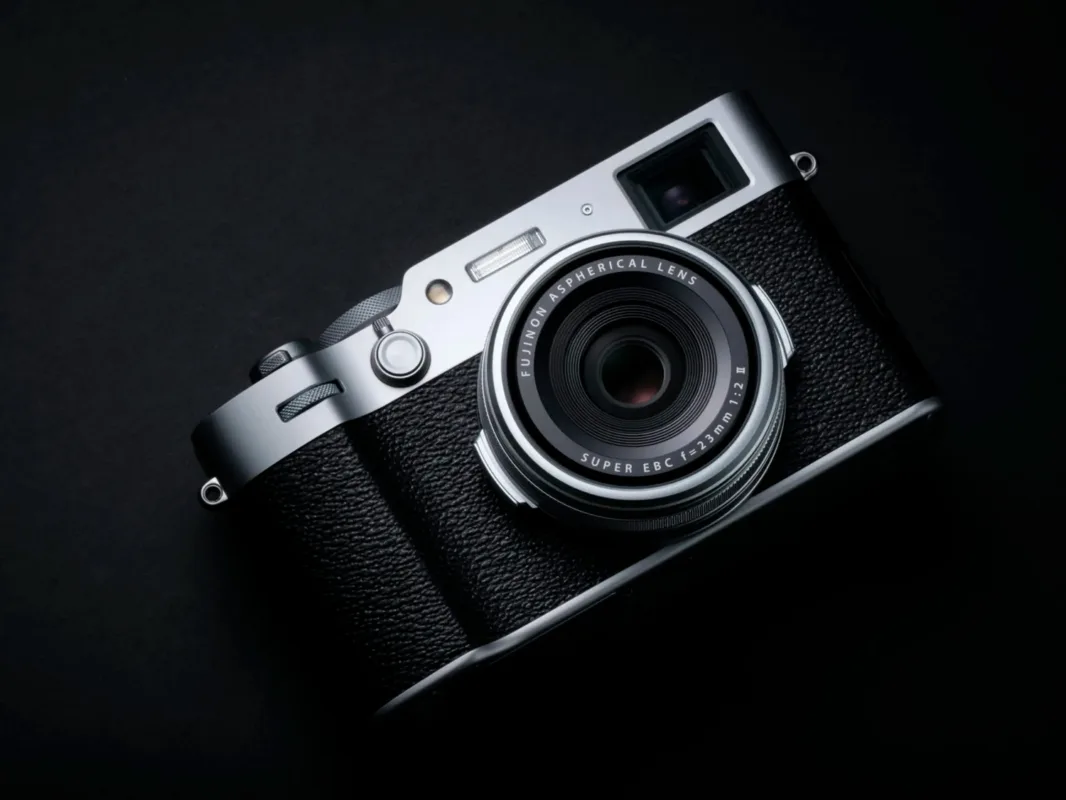
Fujifilm X100VI camera with a silver finish on black textured background — limited edition fine art print by Ludwig Favre

Why I Chose the Fujifilm X100VI

As a photographer who usually works with medium format and high-end gear, I never expected a compact APS-C camera to become an essential part of my daily creative life. But the Fujifilm X100VI changed that, and then changed my mind again. This isn’t just a technical review; it’s the honest story of why this camera won me over, became my favorite everyday companion, and why I eventually decided to sell it.

Falling Back in Love with Spontaneity

When you’re used to shooting with large, heavy cameras, photography becomes a ritual: planning, setup, intention. But what about the unexpected moments? The quiet corners of daily life, the light falling just right on a street, a quick portrait of someone passing by?

The X100VI made me fall in love with spontaneous photography again. It’s light, always with me, and it lets me focus on seeing rather than setting up.

Why I Chose the Fujifilm X100VI

I bought the X100VI for three simple but powerful reasons:

  • IBIS (In-Body Image Stabilization). A game-changer. I can shoot handheld at slower shutter speeds and still get crisp images. Perfect for low light, or for keeping subtle motion blur intentional rather than accidental.
  • 40MP sensor. That’s a lot of resolution in such a compact body. I can crop in post, print large, and still retain beautiful detail and color depth.
  • Design and discretion. It looks timeless, almost like a vintage rangefinder, and people don’t read it as a “serious camera.” That helps me capture authentic, unguarded moments, especially when photographing strangers or street scenes.

A Word About Film Simulations

One of the most iconic features of Fujifilm cameras is their film simulations, and the X100VI offers an incredible range. Classic Chrome, Nostalgic Negative, Acros, Provia… each one brings a different emotion and atmosphere.

I often use them as a visual guide while shooting, to see how the light and tones might render. But personally, I shoot mainly in RAW. I like having full control in post-production. Developing the image later in Lightroom, shaping the colors and tones based on how I felt in the moment, feels better than being locked into a baked-in JPEG. Still, I love that Fujifilm gives me both inspiration and flexibility.

The Strengths of a Small Sensor

Yes, it’s an APS-C sensor. That’s not a downside. It’s a strength when you put it in context.

  • Depth of field is easier to manage, which is perfect for street, travel, or spontaneous portraiture.
  • Lighter lenses, faster autofocus, and better portability are all part of the APS-C charm.
  • The files are still incredibly detailed, and Fuji’s color science brings everything to life.

Combined with IBIS and high resolution, this small sensor performs far beyond expectations.

Image Quality That Surprises Me Daily

There are days I leave my Hasselblad or Mamiya at home and just carry the X100VI. When I get back and look at the files, I’m genuinely surprised at what this little machine can do.

The tones. The colors. The clarity. Even straight out of camera, the images have depth and soul. But when I process the RAW files, that’s where the magic really happens.

What I Don’t Love (But Can Live With)

No camera is perfect, and the X100VI has a few limitations worth mentioning:

  • Fixed lens. You have to love this focal length (equivalent to 35mm full frame). It’s versatile, but not for every situation. For my kind of daily work, it’s ideal: fast, discreet, and sharp.
  • Dynamic range. In extreme lighting situations, it doesn’t have the same highlight retention as a full-frame or medium format sensor. With careful exposure and post-processing, it’s rarely an issue, but it’s there.
  • Price. The X100VI is not cheap anymore. But you’re paying for build quality, performance, and a unique balance between analog soul and digital reliability.

A Camera That Fits into My Life

Whether I’m walking the streets of Paris, exploring a quiet town in Wyoming, or chasing light in California, the X100VI was always in my bag or around my neck. It didn’t get in the way. It became part of the rhythm of daily life.

It’s the camera I used when I wasn’t “working.” But strangely, some of my favorite images, the most honest, the most intimate, came from it.

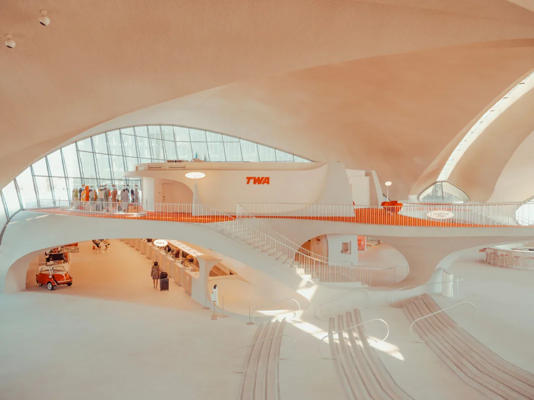
Architecture finalist image with Hasselblad Masters logo, dramatic — limited edition fine art print by Ludwig Favre

Hasselblad Masters 2026 finalist

Hasselblad Masters 2026 Finalist, Architecture category.

Published April 28, 2026


The email that changed everything

There are emails you open without thinking, and then there’s that one. The one that starts with “CONGRATULATIONS” in capital letters .

Today, I’m incredibly proud to announce that my photograph has been selected as a finalist in the Hasselblad Masters 2026 the most prestigious photography competition in the world.

Over 100,000 images. One selection.

To grasp what this really means, a few numbers:

  • Over 100,000 photographs submitted this year  a record-breaking total
  • 7 categories spanning every style of photography
  • Only a handful of finalists per category

Being chosen among these finalists, after a careful pre-selection by the Hasselblad team, means seeing your work recognized at the highest international level. And honestly, I still can’t quite believe it.

What are the Hasselblad Masters?

For more than 20 years, the Hasselblad Masters has celebrated the most talented photographers around the globe. Hasselblad  the legendary Swedish brand that traveled to the Moon with the Apollo missions  rewards artists who push the boundaries of the image every two years.

TWA-Blog

What’s next? I need you.

The final vote rests on two juries:

  1. The Grand Jury, made up of leading figures in international photography
  2. The Public Jury  that’s YOU

The public vote counts as one full jury seat. Every single click can tip the scales.

👉 How to vote?

Head to the official site and support my entry:

https://www.hasselblad.com/inspiration/masters/2026/

Voting is open today through June 2026. Winners will be announced on June 30, 2026.

Thank you

To everyone who has followed my work for years, to those discovering my photos for the first time today, to my family, my friends, and everyone who pushed me to submit despite the doubt: thank you.

This nomination isn’t just a personal milestone. It’s the result of every encounter, every piece of advice, every honest critique that has shaped my vision over the years.

Now, let’s make this vote count. Share, vote, and live this adventure with me.


🔗 Vote for my photo: Hasselblad Masters 2026 — Finalists

📧 Press contact: hello@ludwigfavre.com

📸 Follow the journey: instagram : @ludwigfavre


#HasselbladMasters2026 #Photography #Finalist #PhotoContest

Nostalgia-project Ludwig Favre

Why You Should Not Buy AI Generated Prints

Why You Should Not Buy AI Generated Prints

What the NFT collapse taught us, and what a photograph still does.

In March 2021, Christie’s auctioned a JPEG called Everydays: The First 5000 Days by the artist Beeple for sixty-nine million dollars. The buyer received a string of characters on a blockchain. Within two years the broader NFT market had collapsed by more than ninety-five percent in average value. The same JPEG, today, is worth the price of a coffee. When it sells.

There is a lesson in that sentence, and it is not a technological one. It is the oldest lesson in art collecting: an object without a soul will not hold its value, no matter how loudly the market insists.

The same lesson is now arriving at our doorstep with AI-generated prints.

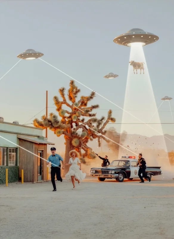
NOSTALGIA Project

What an AI image actually is

When you ask a model to generate an image of a swimming pool in Palm Springs at sunset, the machine does not go to Palm Springs. It does not stand in the heat. It does not wait for the right hour, the right cloud, the right shadow to fall across the diving board. It searches its training data, finds a statistical average of every image it has ever been shown that resembles “swimming pool, Palm Springs, sunset,” and produces something that looks like the consensus of those images.

There is no encounter. There is no decision. There is no time. There is no place. There is no body in the world doing the looking.

What you receive on paper is the visual equivalent of a sentence written by a calculator: technically correct, statistically plausible, and entirely unwitnessed.

What a photograph actually is

A photograph is the opposite. It is, by its nature, the trace of an encounter. Someone was there. Someone chose to stand at this corner, at this hour, on this morning, for reasons that may not be entirely clear even to them. Someone waited. Someone framed. Someone pressed.

That presence is the entire content of the medium. The French critic Roland Barthes called it the that-has-been: the photograph’s most fundamental claim is that this thing was here, in front of a person, at a moment that will never return.

An AI image cannot make that claim. It can imitate the look, the grain, the color cast. It cannot imitate the having-been-there.

This is not nostalgia. It is the structural difference between a record and a synthesis.

The NFT lesson, in plain language

The NFT bubble was instructive because it tested, with real money, the proposition that a digital image alone, divorced from any physical or experiential anchor, could function as a collectible asset. The market said yes, briefly, at the height of the speculative wave. Then it said no, decisively, when the speculation ended.

What collapsed was not the technology. The technology still works. What collapsed was the assumption that ownership of a generated or replicable image, with no soul behind it, constituted a valuable thing.

AI-generated prints are walking into the same trap, in physical form. The image is impressive on a phone screen. It looks reasonable on a wall. But the moment a collector asks the question that every collector eventually asks, who made this, and why, and was anyone there, the print has nothing to answer with.

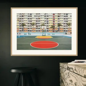
Hong Kong Basketball Court

The eye that cannot be replicated

There is something a model cannot copy, no matter how many billion images it ingests, and that is a single human eye returning to the same subject for years, deciding what it cares about, refusing to photograph what it doesn’t.

A photographer’s signature is not a graphic style. It is a long catalogue of choices: which corner to stand on, which hour to wait for, which light to refuse, which subject to come back to seven years later because the first photograph was wrong. That accumulated decision-making is what makes a body of work coherent, and what makes a single print belong to it.

When you buy a fine art print, you are buying the result of a specific morning, a specific afternoon, a specific moment when one person decided this frame was the right one. The print is a piece of that decision. The certificate of authenticity is a piece of paper. The decision itself is the actual asset.

A model has no decision. A model has a probability distribution.

The collector’s logic

The art market has always rewarded scarcity, intentionality, and provenance. AI prints fail all three.

Scarcity. The same prompt can generate ten thousand variations. There is no edition because there is no original.

Intentionality. The model has no preference. It does not love the morning light. It does not return to the same building.

Provenance. The chain of decisions behind the image is empty. There is nothing to attribute, nothing to authenticate, nothing to certify in any meaningful sense.

This is why secondary markets for AI prints do not exist, and why they will not exist in the way they exist for photography. The first wave of buyers may pay. The second wave will not.

What you are actually buying

When a print enters your home, you are not only buying an image. You are buying the fact that someone went to make it. You are buying the time, the distance traveled, the hour waited for, the choice that nobody asked for. You are buying, in a real sense, a fragment of someone else’s attention.

That fragment is what makes a print last on a wall and last in a market. It is the only thing that does.

The NFT collapse should have taught us that no amount of technological packaging can substitute for that fragment of attention. The AI print wave is repeating the same mistake, in higher resolution.

Buy the eye. Buy the morning. Buy the decision.

The image is the proof, not the asset.


Discover limited edition fine art photography prints by Ludwig Favre, signed and numbered, made on location across Palm Springs, New York, Paris, Miami, and the California coast.

Fine Art Prints-New-York-The-Day-After-Blizzard-Ludwig-Favre

Cinematic Urban Photography: Film Look in Lightroom Ludwig Favre

What Is Cinematic Urban Photography And How to Achieve That Film Look in Lightroom

By Ludwig Favre

There is a quality to certain photographs that stops you mid-scroll. The colors feel slightly off in the best possible way. The shadows are deep but never harsh. The highlights glow with a warmth that no digital sensor quite produces on its own. The city looks like a movie set, suspended in a version of itself that is more beautiful than reality, yet somehow more honest.

This is cinematic urban photography. And it doesn’t happen by accident.

In this article, I want to break down exactly what creates that look from the film stocks that inspired it, to the specific way I process RAW files in Lightroom, to the presets I’ve developed over years of shooting cities across the US and Europe.

What “Cinematic” Actually Means in Photography

The word gets overused. Every other Instagram filter is called “cinematic.” But the real meaning is specific.

Cinema, particularly American cinema of the 1970s through the 1990s, was shot on color negative film stock under controlled, deliberate lighting conditions. The result had certain consistent characteristics: lifted blacks (shadows that never go fully dark), slightly desaturated midtones, warm highlights that push toward orange and yellow, and a distinct color cast that varied by stock and lab processing.

When we talk about cinematic photography, we’re chasing that specific color science. Not the look of a random film stock, but the particular palette of a carefully exposed, carefully processed negative, the kind you’d see in the work of cinematographers like Vilmos Zsigmond, Gordon Willis, or Roger Deakins.

In urban photography, this aesthetic resonates deeply because cities were built for it. Neon signs, streetlights, pools, diners, motels: these are all artificial light sources with strong color temperatures that film stock renders in ways digital sensors flatten or neutralize. A tungsten-balanced film stock like CineStill 800T, shot under sodium vapor streetlights at dusk, produces colors that digital cannot replicate without deliberate post-processing.

CineStill 800T: The Film Stock Behind the Look

If you’ve spent time in fine art or editorial photography circles over the past decade, you’ve encountered CineStill 800T. It is the most distinctive film stock available today for urban, low-light shooting, and it’s the primary reference point for the cinematic look I pursue in both my film and digital work.

CineStill 800T is derived from Kodak Vision3 500T motion picture film, modified for C-41 processing by removing the remjet antihalation backing. That removal is what gives CineStill its most recognizable characteristic: halation. Light sources in the frame bleed a red or orange halo into surrounding areas, an artifact that in motion picture film is controlled by the remjet layer, but in CineStill bleeds freely.

This halation is not a flaw. It is the signature. A streetlight surrounded by a soft red glow, a motel sign bleeding pink into the night sky, a swimming pool lamp casting a corona across the water surface: this is what makes a CineStill image instantly recognizable, and it’s what I try to approximate in digital post-processing.

Beyond halation, CineStill 800T has a specific color response when exposed under tungsten or mixed artificial light:

  • Warm highlights: sodium and incandescent sources push toward deep amber and burnt orange
  • Cool shadows: the shadows retain a blue-cyan cast that contrasts against the warm lights
  • Compressed dynamic range: highlights roll off softly rather than clipping abruptly
  • Lifted blacks: true black is almost never achieved; shadows sit at a dark gray that retains detail and atmosphere

These four characteristics are the foundation of the cinematic look in urban photography. Everything I do in Lightroom is oriented around reproducing them from a digital RAW file.

Processing the Cinematic Look in Lightroom: My Approach

Shooting RAW gives you the latitude to build this aesthetic from scratch. Here is how I approach it, step by step.

1. Tone Curve: Lift the Blacks First

Before touching anything else, I go to the Tone Curve and lift the black point. I drag the bottom-left anchor point of the curve upward, typically to somewhere between 15 and 25 on the output value. This single move eliminates true black from the image and gives the shadows that characteristic film-like softness. It is the most important step in achieving a cinematic feel, and it’s the one most beginners skip.

2. Color Grading: Warm Highlights, Cool Shadows

In the Color Grading panel (formerly Split Toning), I work in two directions simultaneously:

  • Highlights: push toward orange-amber (hue around 35–45°, saturation 15–25). This mimics the way tungsten-balanced film renders warm light sources.
  • Shadows: push toward cyan-blue (hue around 210–230°, saturation 10–20). This creates the cool shadow contrast that defines the CineStill look.

The balance between these two is everything. Too aggressive and the image looks like an Instagram filter. Subtle and controlled, and it reads as a photograph that simply has exceptional color.

3. HSL: Desaturate the Midtones

CineStill doesn’t produce hyper-saturated colors. The palette is rich but controlled. In the HSL panel, I typically reduce the saturation of greens and yellows (which can read as overly digital) and slightly boost the oranges and reds, which are the tones most affected by tungsten light sources.

The goal is a palette where no single color dominates, where the image feels balanced and analog rather than digitally processed.

4. Texture and Grain

Film grain is not noise. Digital noise is random and ugly. Film grain has structure and contributes to the tactile quality of the image. In Lightroom, I add grain via the Effects panel, typically Amount 20–35, Size 25–35, Roughness 50. The exact values depend on the image and the intended print size, but some grain is almost always present in my processing. It is what separates a digital photograph that looks like film from one that merely references it.

5. Lens Corrections and Vignetting

I apply a moderate vignette (around -15 to -25 in the Vignetting slider) to draw the eye toward the center of the frame and add depth. This is a cinematic technique: cinema lenses produce natural vignetting, and replicating it digitally adds to the analog feel.

From RAW Processing to Fine Art Prints

The color work done in Lightroom is only meaningful if it survives the printing process. Cinematic color, with its warm highlights and cool shadows, is particularly demanding to print accurately. The amber tones can shift toward yellow, and the shadow blues can flatten to neutral gray on papers that don’t handle color separation well.

This is why I print exclusively on museum-quality archival paper using pigment inks rated for over 100 years of color stability. The printing process is calibrated to the specific color profile of my images: the warm-cool split in the Color Grading panel has to be reproduced with precision for the print to carry the same atmosphere as the screen image.

Every limited edition print I produce goes through this calibration process. It’s the difference between a photograph that looks cinematic on screen and one that genuinely looks cinematic on a wall.

Take the Look Further with My Lightroom Presets

Everything I’ve described above, the lifted blacks, the warm-cool color grade, the controlled grain, the HSL adjustments, is built into the Lightroom presets I’ve developed and refined over years of shooting cities from New York to Palm Springs, Los Angeles to Paris.

These are not generic film simulation presets. They are the actual starting points I use for my own prints, designed specifically for urban photography under artificial and mixed light. They work on both RAW and JPEG files and are calibrated for the kinds of scenes you find in cities: neon, tungsten, dusk, street light.

If you shoot cities and you want your images to carry the weight and atmosphere of the look described in this article, these presets are the fastest way to get there.

Explore the Ludwig Favre Lightroom Presets →

Ludwig Favre is a Paris-based fine art photographer known for his cinematic urban imagery. His limited edition prints are collected worldwide and available exclusively at ludwigfavre.com.

Fine Art Prints-New-York-Ludwig-Favre

15 Street Photography Tips for Beginners in 2026

Street Photography Tips for Beginners in 2026 (15 Ways to Make Your Photos Stand Out)

Street photography looks effortless when you scroll through Instagram or photo blogs, but street photography tips for beginners are often unrealistic, complicated, or just not helpful in real life.

Street photography looks effortless when you scroll through social media… but when you step outside with a camera, suddenly everything feels awkward, random, and a little intimidating.

If that’s you, you’re not alone.

This guide shares simple, practical street photography tips for beginners that focus on confidence, storytelling, and consistency so you’re not just “taking random photos in the street,” but actually building images people remember.

1. Street Photography Tips for Beginners: Start With the Camera You Already Have

You don’t need a Leica or a fancy film camera to get started.

Use your smartphone, your old DSLR, or that compact camera you already own. What matters most is how you see, not what you hold. Limiting your gear at the beginning keeps you focused on learning light, composition, and timing instead of endlessly tweaking settings.

If you’re using a phone, turn off all the “beauty” filters and shoot in the native camera app or a simple manual app. The more natural your image, the more it feels like real street photography.

2. One of the Best Street Photography Tips for Beginners: Pick One Neighborhood and Commit to It

Instead of wandering everywhere, choose one area and treat it like your personal outdoor studio.

Walk the same streets at different times of day. Notice how the light changes, how people move, where the reflections, shadows, and interesting backgrounds are. By returning often, you’ll start to anticipate moments instead of chasing them.

Great street photos often come from familiarity, not luck.

3. Use Simple Settings So You Can React Fast

You don’t want to be buried in menus when something interesting happens. One of the most underrated street photography tips for beginners is to simplify your settings.

A simple starting point:

  • Aperture: f/5.6–f/8 for enough depth of field.
  • Shutter speed: 1/250s or faster to freeze motion.
  • ISO: Auto ISO with a max you’re comfortable with (for example 3200 or 6400).

If your camera has it, try aperture priority with auto ISO. Set it once, then focus on seeing moments, not fighting settings.

4. Get Closer Than Feels Comfortable

Most beginners shoot from too far away. The result: flat, distant photos with no real emotion.

Try taking one or two steps closer than you normally would. Fill more of the frame with your subject or with a strong foreground. You’ll instantly feel more connected to the scene, and so will the viewer.

Yes, it’s scary at first. But that nervous feeling is usually where the best photos live.

5. Use Light as Your Main Subject

Street photography is not just about people it’s about light.

Look for:

  • Hard sunlight that creates strong shadows.
  • Backlight that silhouettes people.
  • Reflections in windows, puddles, or cars.
  • Patches of light in otherwise dark streets.

Sometimes the scene itself is ordinary, but the light makes it magical. If you train your eye to chase light first, your photos will instantly look more intentional.

Ludwig-Favre-Lightroom-Presets

6. Find a Great Background and Wait

You don’t always have to hunt for the perfect moment. Sometimes, you can let the moment come to you.

  1. Find an interesting wall, sign, doorway, or patch of light.
  2. Compose your frame and lock in your focus.
  3. Wait for someone to walk through your scene.

This technique often called “fishing” is ideal for beginners because you’re only thinking about one thing at a time: timing.

7. Tell a Story, Not Just “Take a Picture”

Ask yourself: what am I trying to say with this image?

It can be small and simple:

  • Contrast between old and new.
  • Loneliness in a busy city.
  • Humor in everyday life.

If you have even a tiny story in mind, your choices (light, angle, timing) become clearer. That’s how you move from “random snapshots” to memorable street photos.

8. Respect People, But Don’t Overthink Permission

Ethics matter more than ever in 2026.

You don’t always need explicit permission for candid photography in public spaces (depending on local laws), but you do need empathy. Don’t shoot in a way that feels exploitative, cruel, or mocking.

If someone notices you and looks uncomfortable, a simple smile, a nod, or “Hey, I’m just practicing street photography, hope that’s okay” goes a long way. Most people are curious or flattered; a few will say no, and that’s fine just move on.

9. Use Burst Mode for Fleeting Moments

Street moments often happen in half a second: a glance, a gesture, a beam of light on someone’s face.

Use continuous shooting or burst mode for fast-moving scenes. Later, you can pick the one frame where the expression, posture, or timing is perfect. The difference between a “good” and “great” street photo is often just one frame.

10. Look for Layers, Not Just Subjects

Instead of photographing one person in the middle of the frame, try adding layers:

  • Foreground: a silhouette, a window frame, a person out of focus.
  • Middle ground: your main subject.
  • Background: signs, architecture, or another character.

Layers add depth and complexity and keep the viewer’s eye moving through the image. Street photography becomes more cinematic when you think in layers.

11. Shoot Both Wide and Tight

If you only shoot wide, your photos may feel messy. If you only shoot tight, you might lose context.

Experiment with:

  • Wider focal lengths (23–35mm full-frame equivalent) to capture environment and story.
  • Slightly tighter focal lengths (around 50mm) to isolate gestures and expressions.

Over time, you’ll discover which focal length feels most natural for your style but at the beginning, play with both. Testing different focal lengths is another practical street photography tip for beginners that quickly improves your eye.

12. Embrace Imperfections

Street photography isn’t meant to be “perfect.”

Blur, grain, slightly crooked frames, motion it can all add energy and emotion. Don’t delete a photo just because it’s not technically clean. Ask yourself first: does it make me feel something?

Some of the most iconic street photographs are imperfect by traditional standards, but unforgettable in mood.

13. Edit Consistently: A Key Street Photography Tip for Beginners

Editing doesn’t need to be complicated, but it should be consistent.

Pick one app or software (for example Lightroom, VSCO, or your camera’s built-in app) and create a simple preset that matches the mood you like: contrasty and bold, soft and muted, or classic black & white.

Apply that look across a series of images so your work feels cohesive. A consistent edit helps people recognize your style, which is powerful for both creativity and social media growth.

If you edit in Lightroom, you can start with a simple base preset and tweak it for your style. For more ideas, you can link internally here to a blog post on creating your own Lightroom presets.

14. Share Your Work and Accept the Cringe

Posting your early work online can feel painful. Do it anyway.

Sharing your photos:

  • Helps you see your progress over time.
  • Attracts feedback and community.
  • Forces you to finish images, not just let them sit on your hard drive.

Yes, you might look back and cringe at your first photos. That’s proof you’re improving.

You can also link to other helpful street photography resources or official software tutorials as useful external links for your readers.

15. Make Street Photography a Habit, Not a One-Time Event

The best street photographers don’t wait for “inspiration” they build habits.

Aim for small, consistent sessions rather than giant, rare photo days. Even 20, 30 minutes a few times per week is enough to sharpen your eye and build confidence.

Bring your camera when you run errands, commute, or meet friends. The city doesn’t stop moving; you just need to show up often enough to catch it.

Final Thoughts: Your City, Your Story

Street photography is not about copying what you see on Instagram. It’s about learning to notice the beauty, humor, and drama in your own everyday world.

These street photography tips for beginners are here to give you a framework, but your perspective is what really matters.

Start with the camera you have. Commit to one neighborhood. Use simple settings. Get closer than feels safe, chase light, add layers, and let imperfect moments live.

If you keep showing up, your city will start to reveal stories that only you can tell and that’s when your street photography becomes truly your own.